ILLUSTRATIONS
for
'VEGGO'
brand
(IV)
for
'VEGGO'
brand
(IV)
Veggo products take an unique place among assortment of vegan products in my country.
The aim of this brand is to present a variety of this kind of food and to make it more popular.
The aim of this brand is to present a variety of this kind of food and to make it more popular.
This time, the task was to create three illustrations for three different new products.
The greatest challenge was to find appropriate compositions accoridng to a shape of packaging. As always, the first step was a sketching process and a nature study of objects. After the selection of compositions, the final linear illustrations were prepared. The most significant part of the creating process was a covering by colors, finding a tasteful palette and keeping a naturalness of details.
I am thankful for Veggo team giving me such exciting tasks.
_______________________
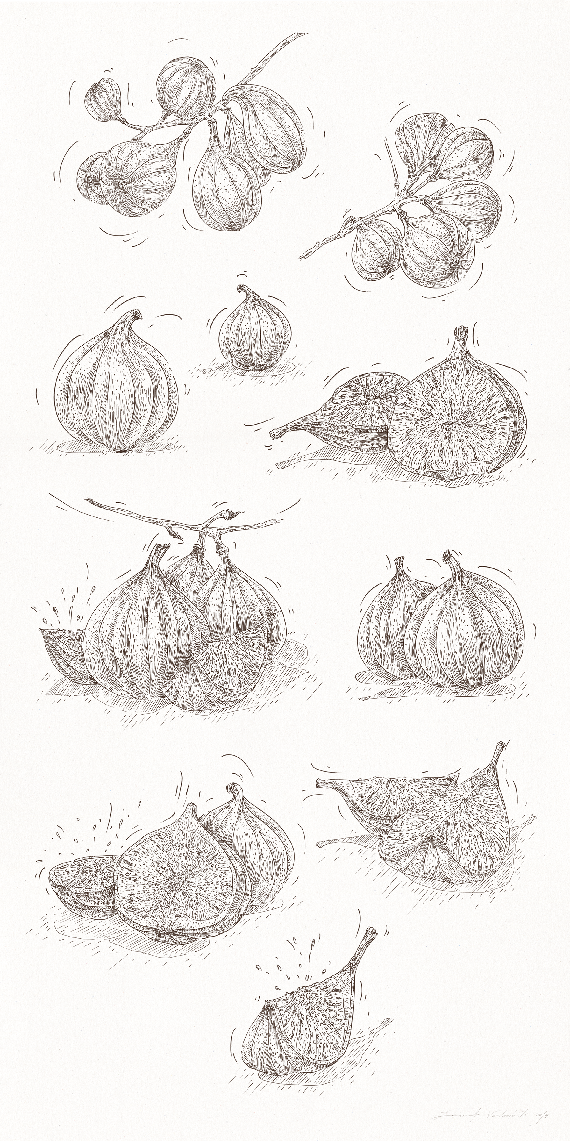
Figs
The illustration represents a vegan cake of figs.
There were suggested ten positions of this kind of fruit and first five were selected and later adapted for the packaging.
Fig does not have a very graphical character. For this reason I had to make some highlightings on its shape.
Below You can see all linear drawings of figs.
There were suggested ten positions of this kind of fruit and first five were selected and later adapted for the packaging.
Fig does not have a very graphical character. For this reason I had to make some highlightings on its shape.
Below You can see all linear drawings of figs.
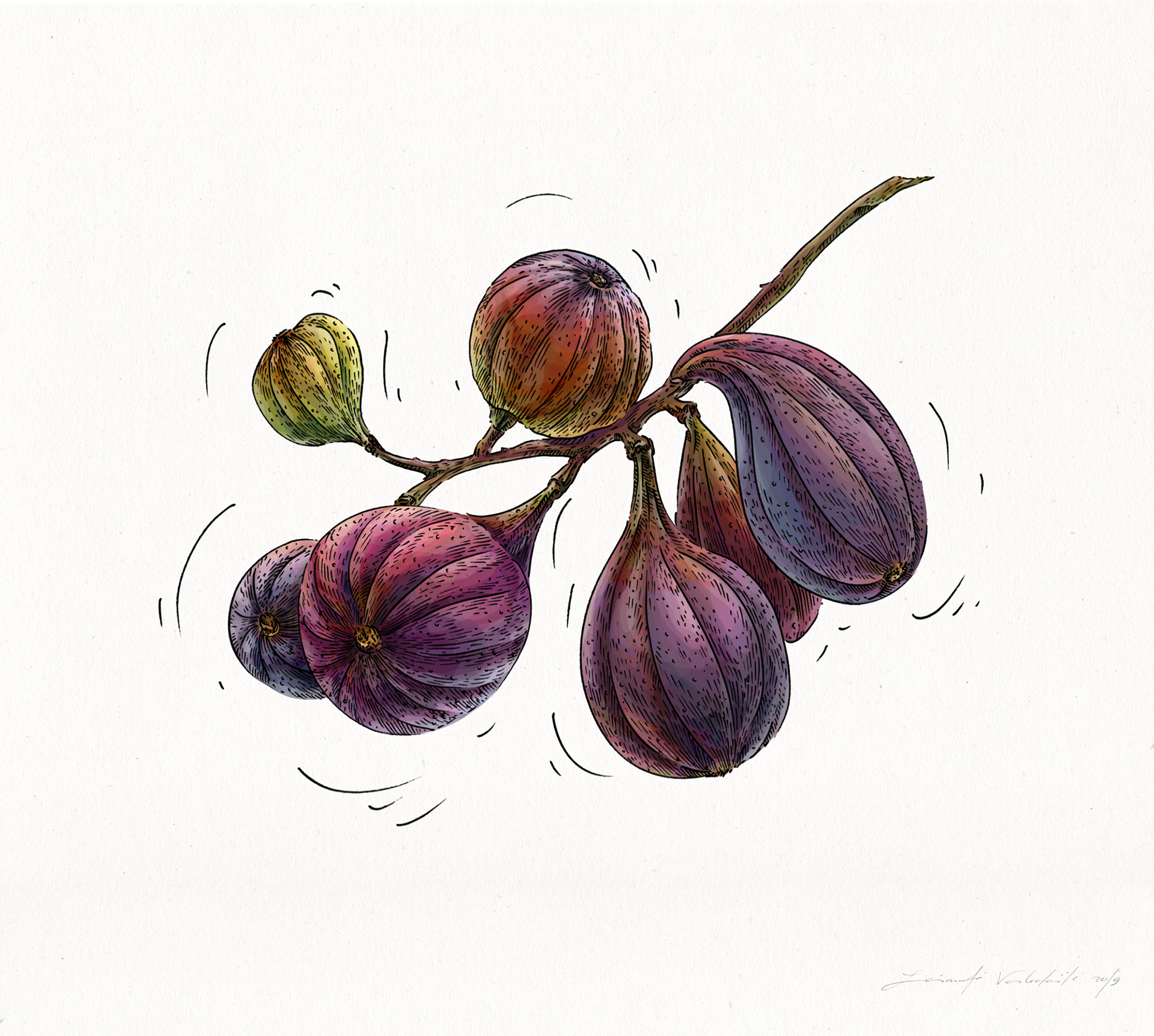
The first position of figs in color.
The coloring process of figs was absolutely one of the most awesome discovery of the whole process. After I have made a nature study of fig, I have noticed how many shades it has and how colors change when the fig grows up. So, I decided to show this process in two of illustrations of figs.
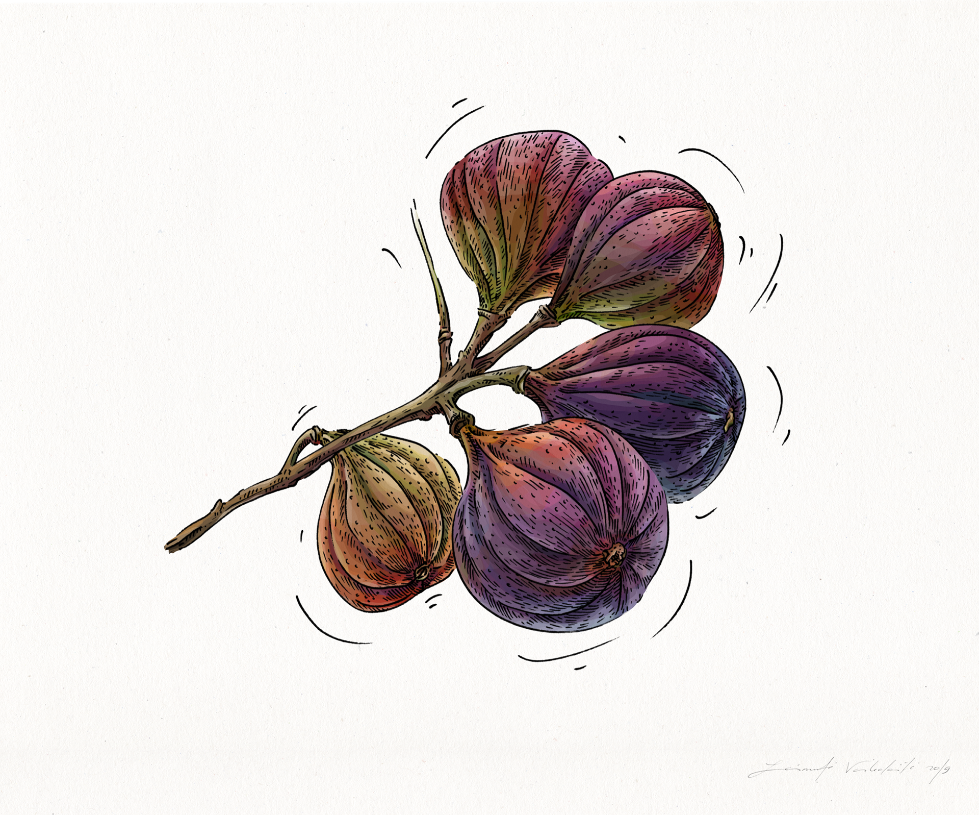
The second position of figs.
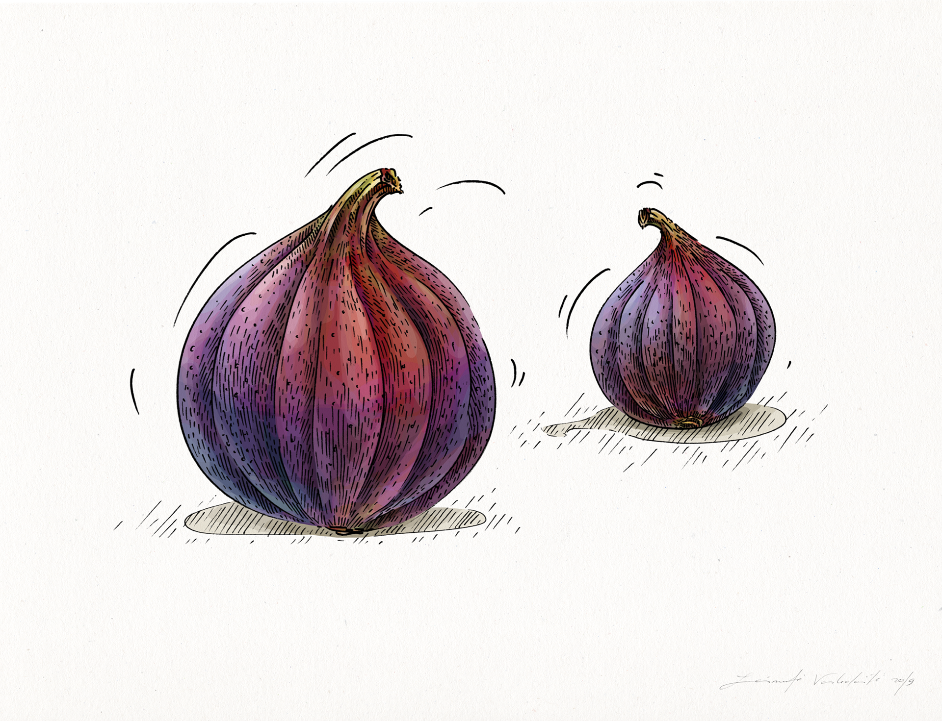
Two single figs in different size.
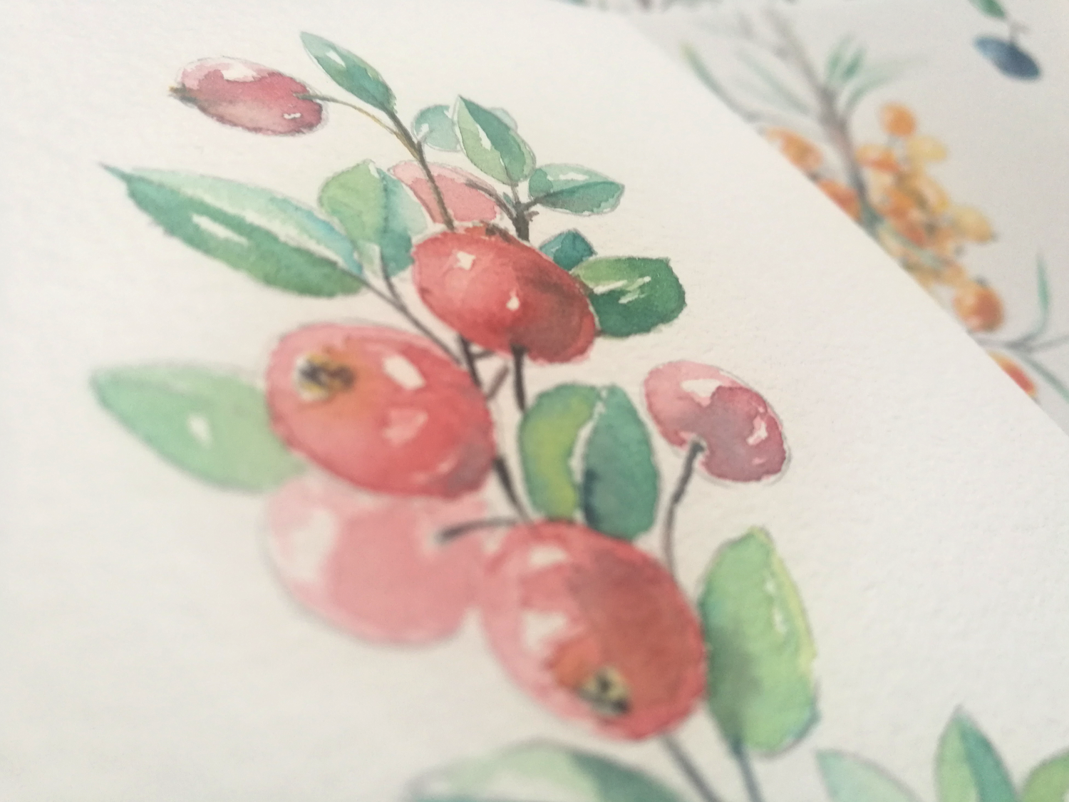
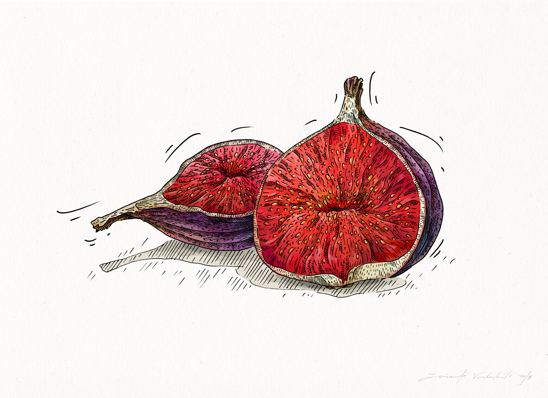
The inside of figs and the bright red appears in a palette of fig colors.
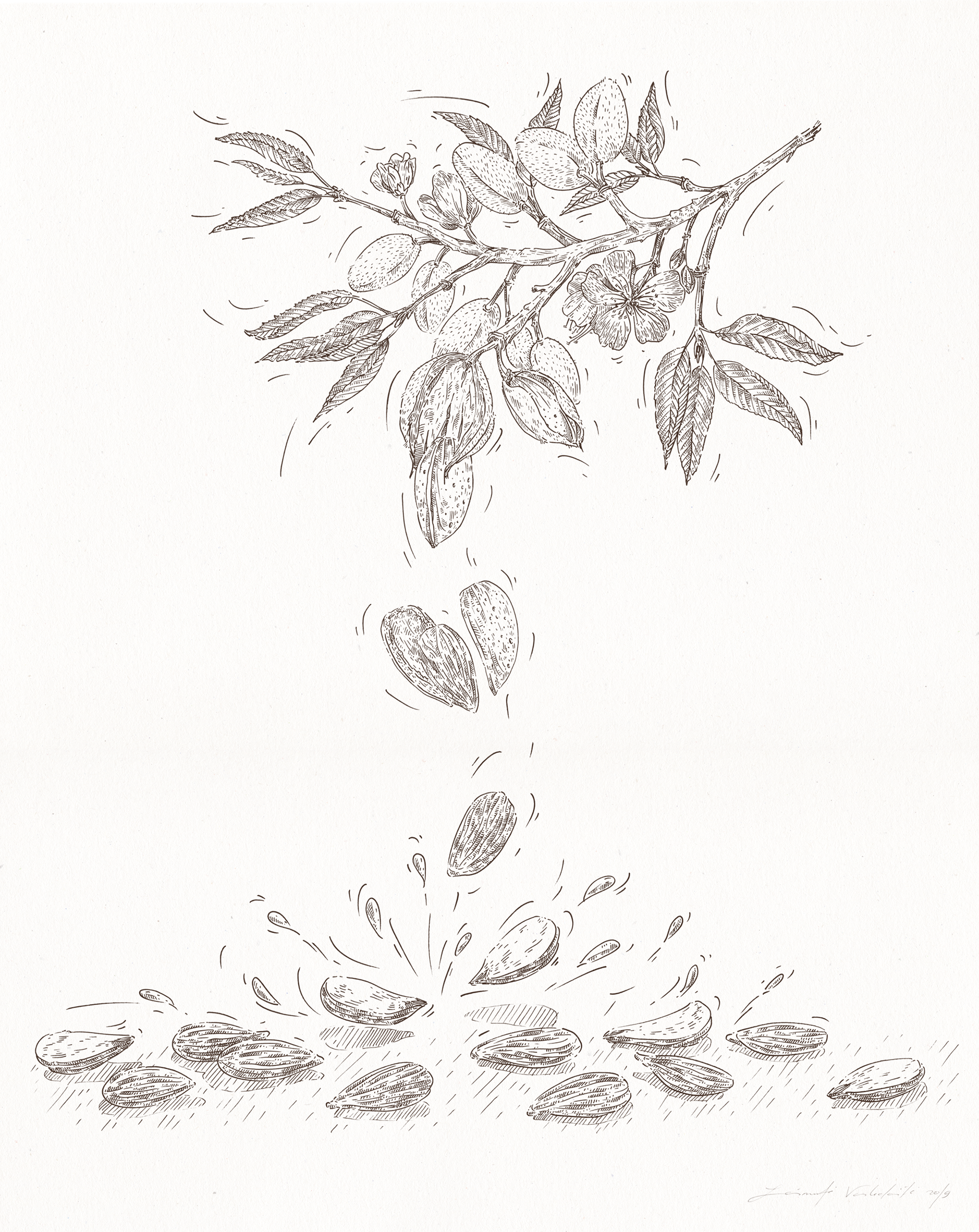
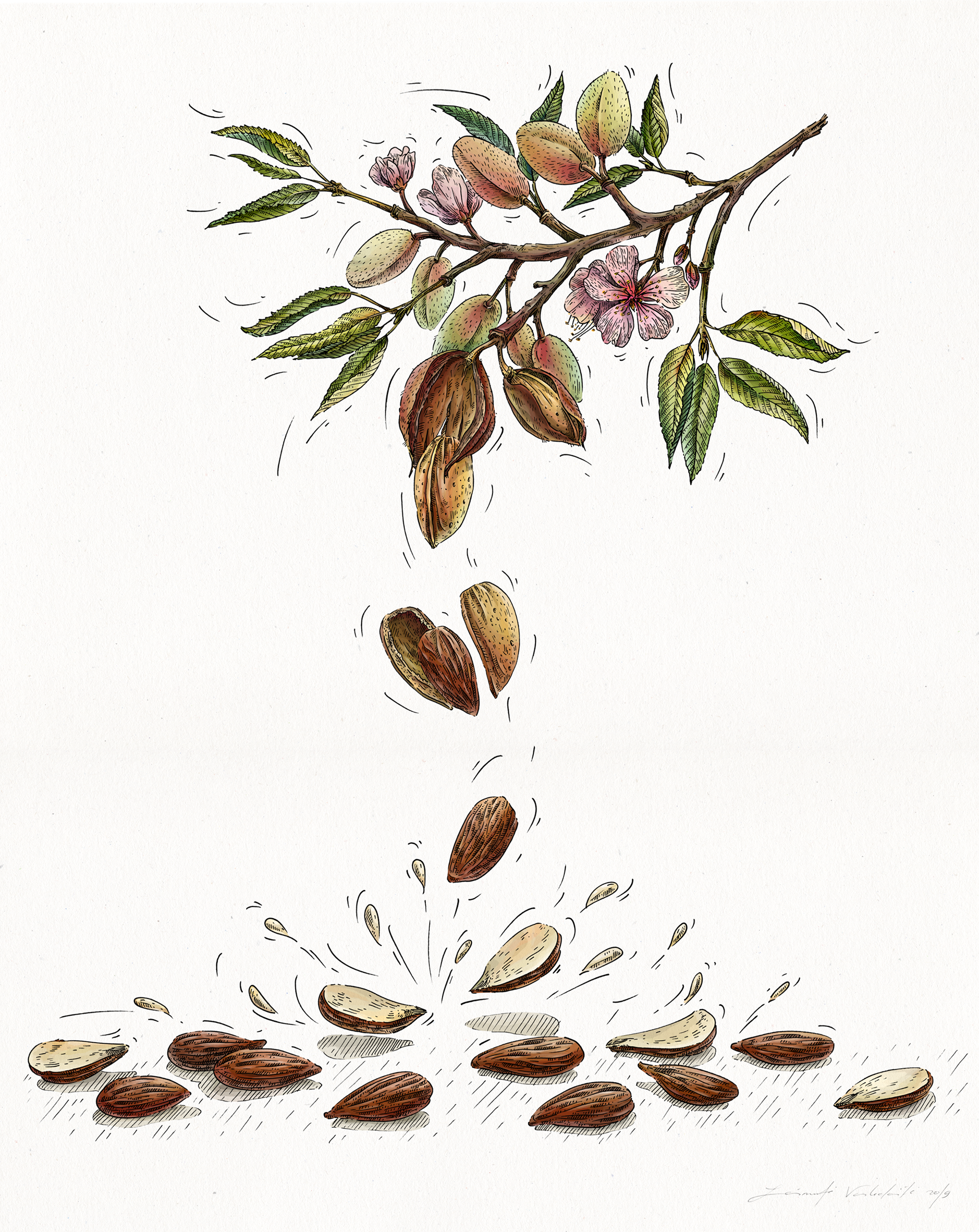
Almond
The illustration was created to present a milk of almond.
The composition was oriented according to a shape of packaging-tetra pak.
An idea was to separate a drawing in two parts (upper and lower) and to make a composition more adaptable in this way.
An idea was to separate a drawing in two parts (upper and lower) and to make a composition more adaptable in this way.
Coloring process of the almond learned me to be more attentive not only to shades, but also how to reveal a different kind of materials. For example, a softness of growing green-yellow-red almonds and a roughness of the branch. That gave me even more practices how to feel a color and its effects in new ways.
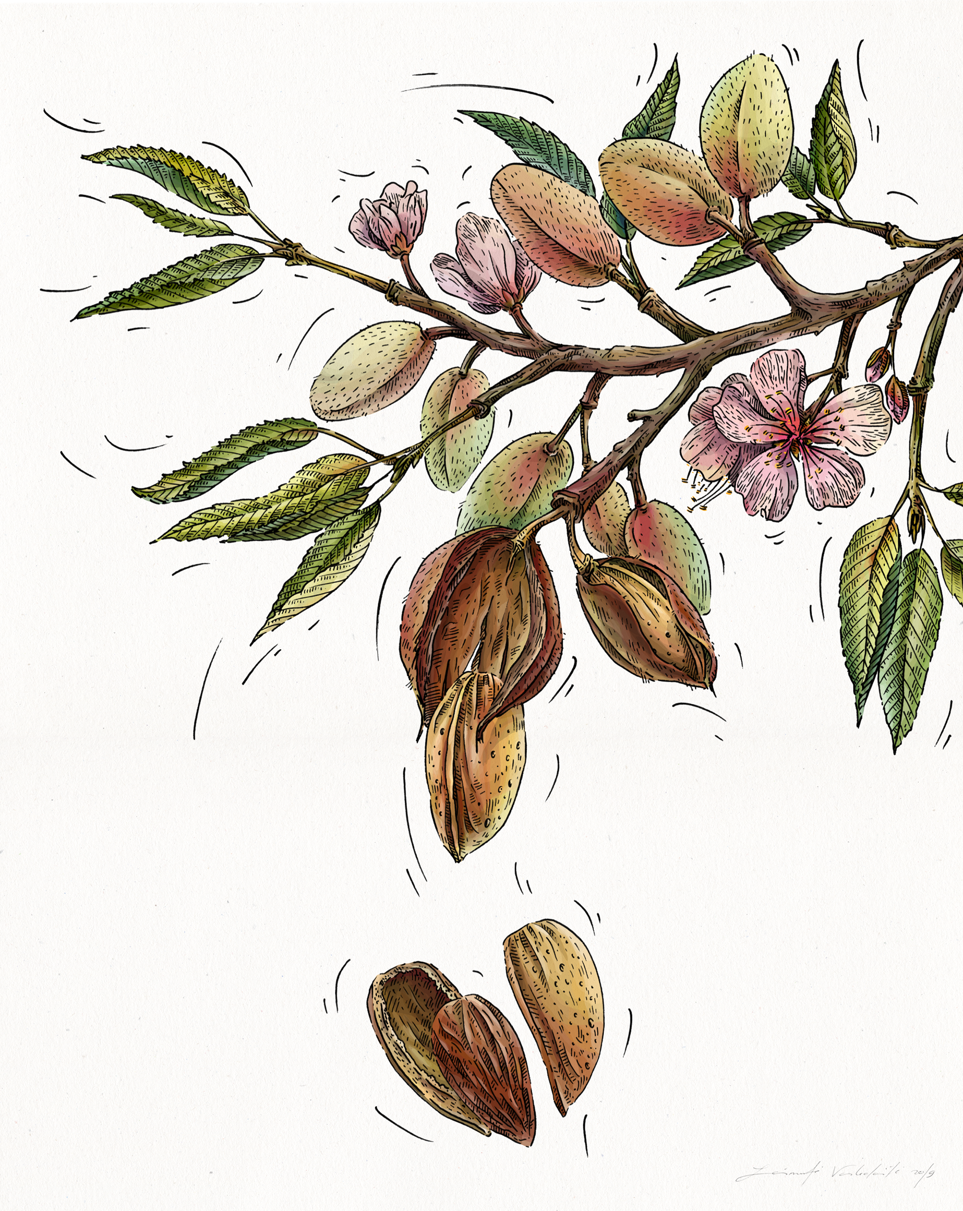
A detail of the almond closer: a variety of tints and the unity of all details composition, combined by colors.
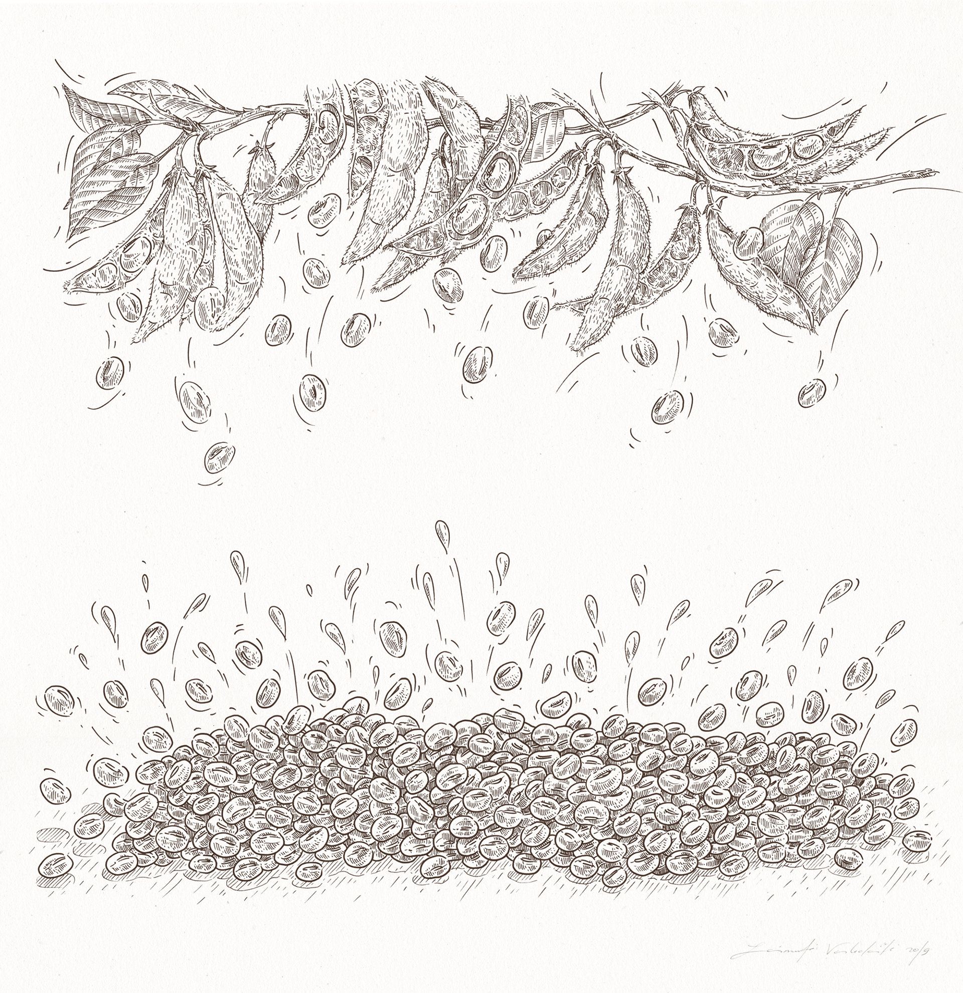
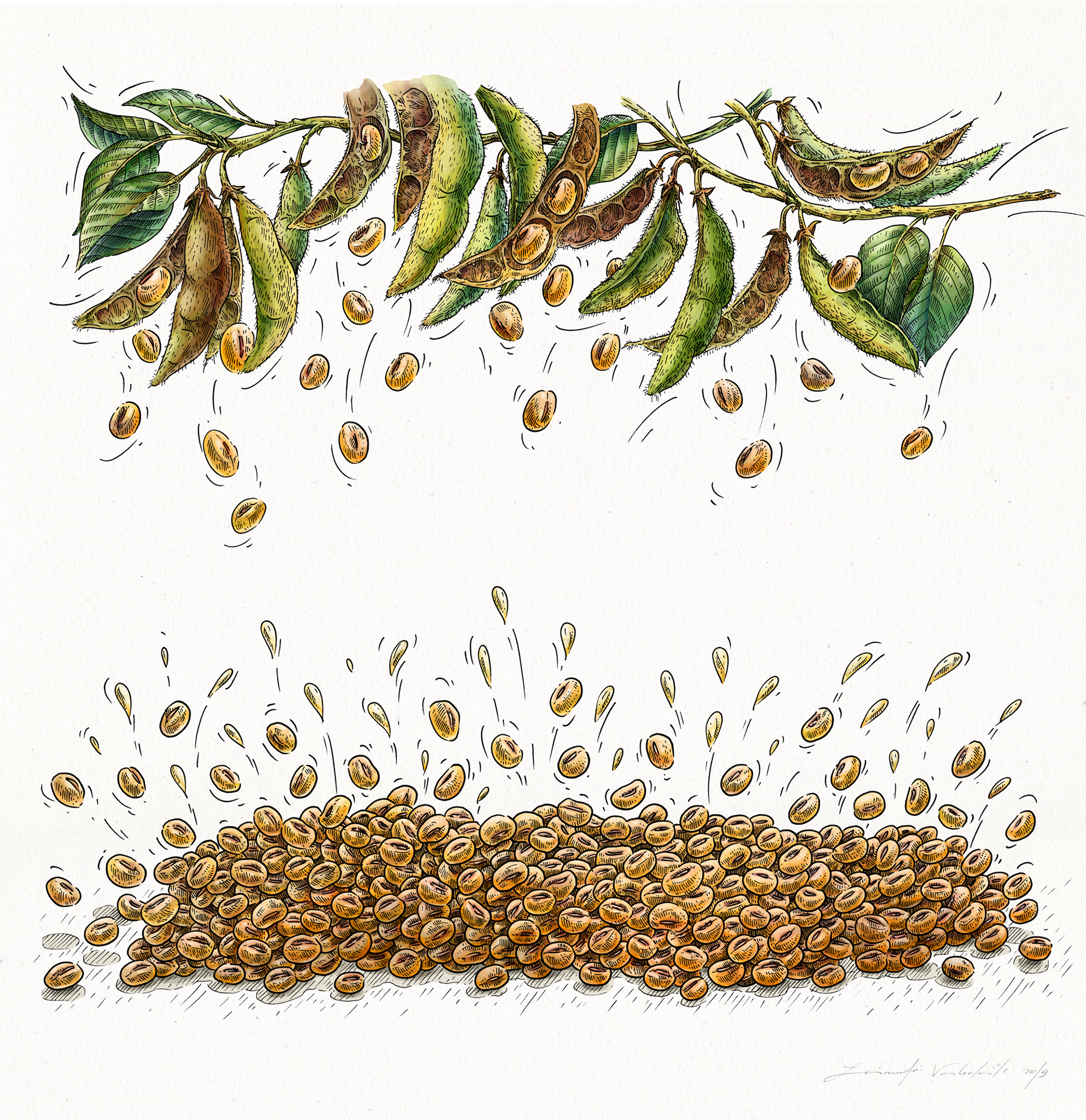
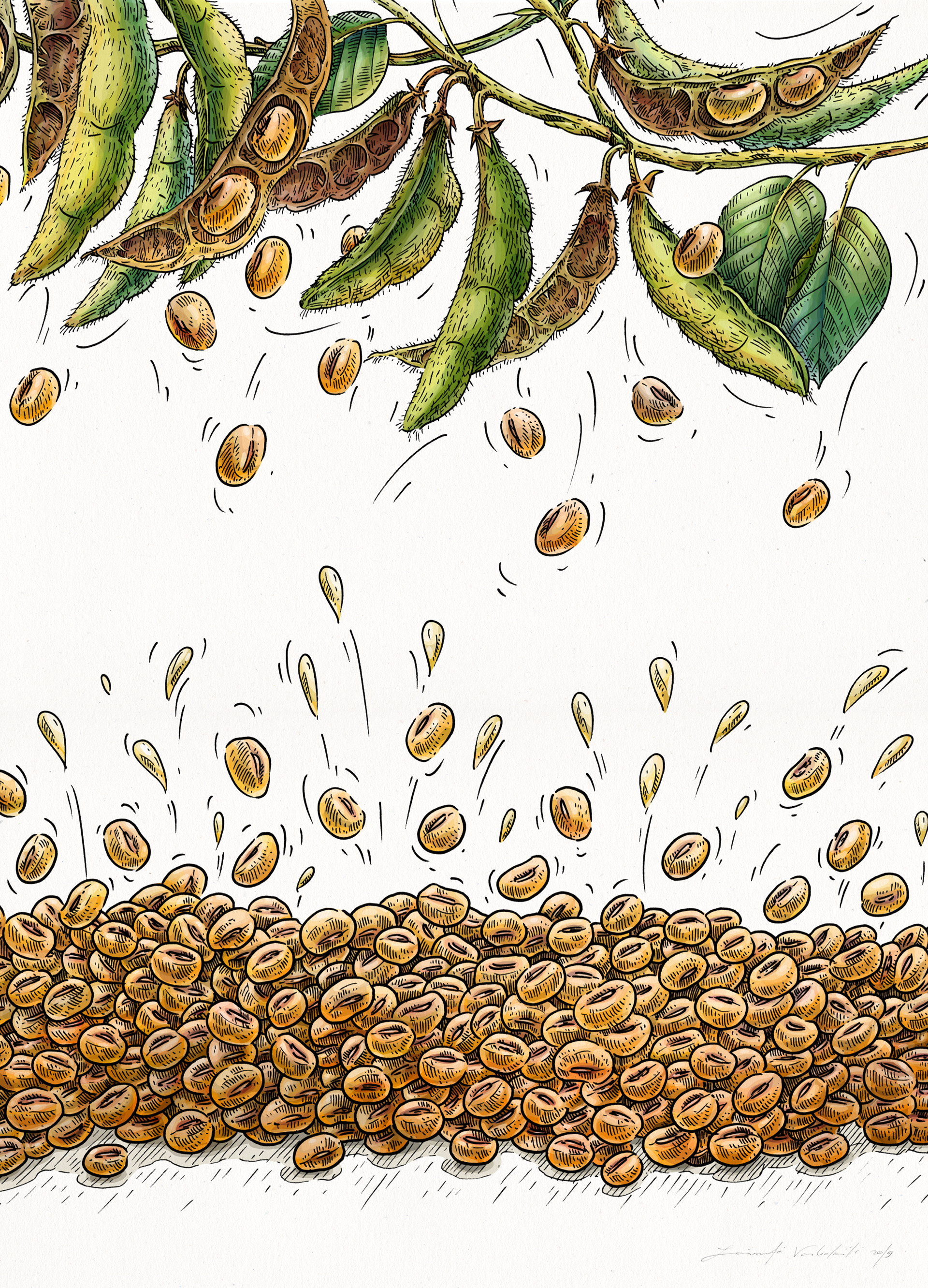
Soy
The illustration was created to present a milk of soy.
That was really one the most detailed illustration created for Veggo brand.
As the drawing of almond, this one also was consisted of two parts.
As the drawing of almond, this one also was consisted of two parts.
The illustration of soy in colors.
Many patience to make each detail and part of composition properly.
Many patience to make each detail and part of composition properly.
A detail of illustration, closer view.
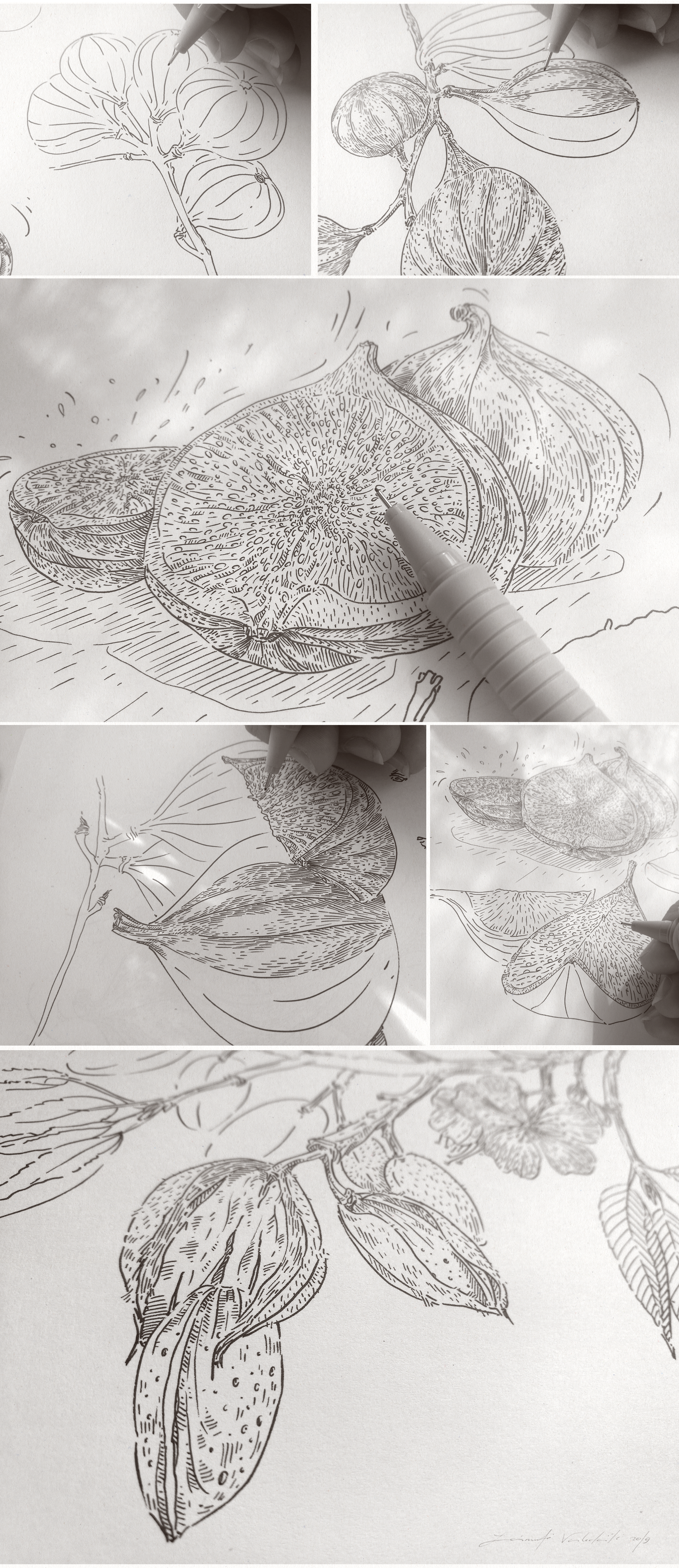
Finally — some details of the process.
All linear drawings were made using a thin tip marker.
Later, illustration were filled by colors using digital graphic media.
I love this combination of graphic techniques, making an illustration more sensitive and viable.
All linear drawings were made using a thin tip marker.
Later, illustration were filled by colors using digital graphic media.
I love this combination of graphic techniques, making an illustration more sensitive and viable.
Thank You for Your attention watching this project! | Ačiū!