One more colorful project created for Veggo brand.
This time — a set of illustrations, which present 16 categories of products.
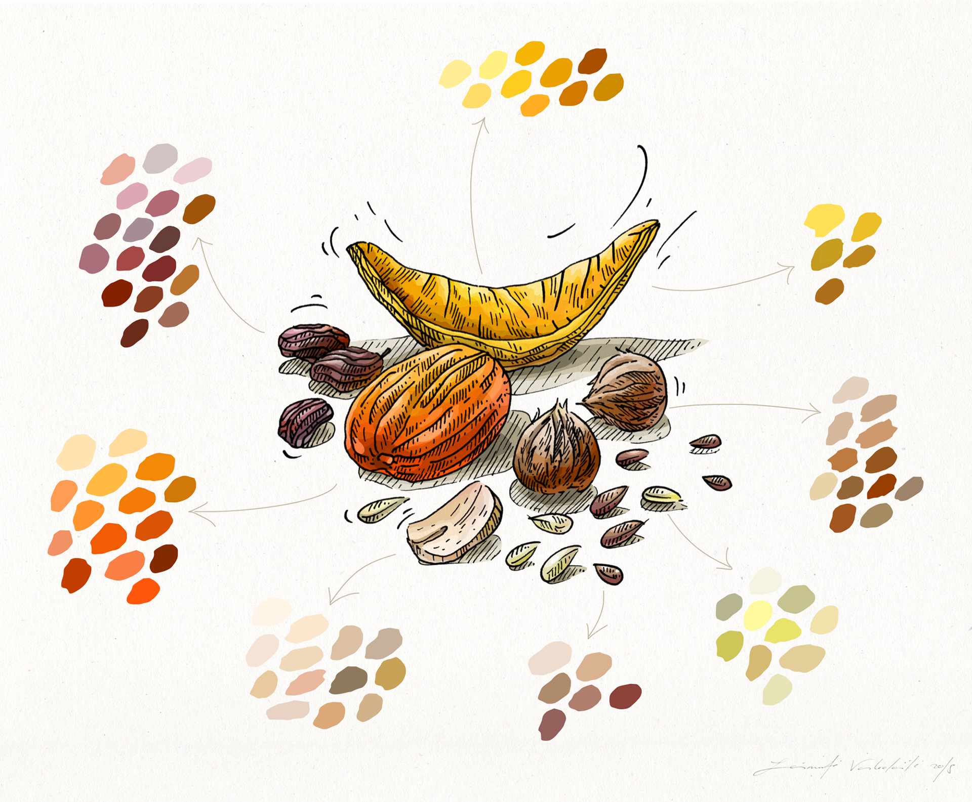
Although images are used in quite small size, they have detailed drawing in order to create a realistic view of objects and also keep the graphic style of Veggo.
Although images are used in quite small size, they have detailed drawing in order to create a realistic view of objects and also keep the graphic style of Veggo.
One of the biggest aims and issues was to keep a variety of colors in such a small size of the picture.
Another aspect was — to find well recognizable and characteristic compositions to each product.
And at last — during all the process to check time after time how images look in a real scale keeping its graphic legibility and identification.
Another aspect was — to find well recognizable and characteristic compositions to each product.
And at last — during all the process to check time after time how images look in a real scale keeping its graphic legibility and identification.
I love to solve Veggo tasks.
This process promotes me to find out more and more about illustration and use new methods in the creative process.
This process promotes me to find out more and more about illustration and use new methods in the creative process.
_______________
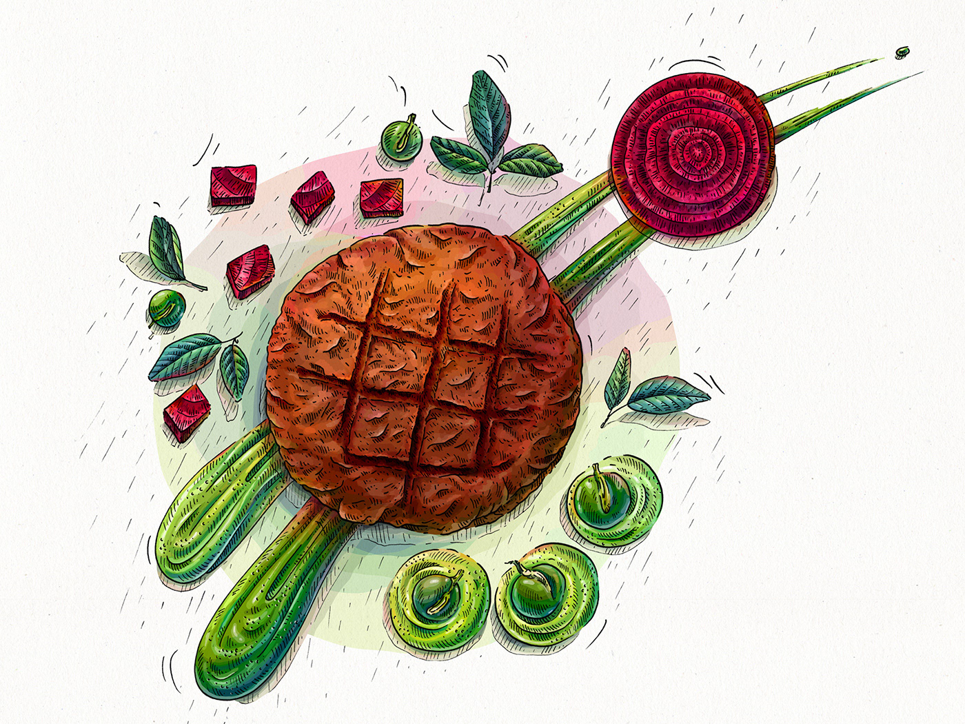
A set of illustrations in linear graphic made using ink pens.

All images in colors.
Using computer graphics, illustration became more material, got characteristic features, even a temperature (e.g. a soup).

A set of illustrations in smaller size.
The aim was to create well recognizable compositions and to reveal an illustrated product in most appropriate way.
Also, there was important to keep a sense of set.
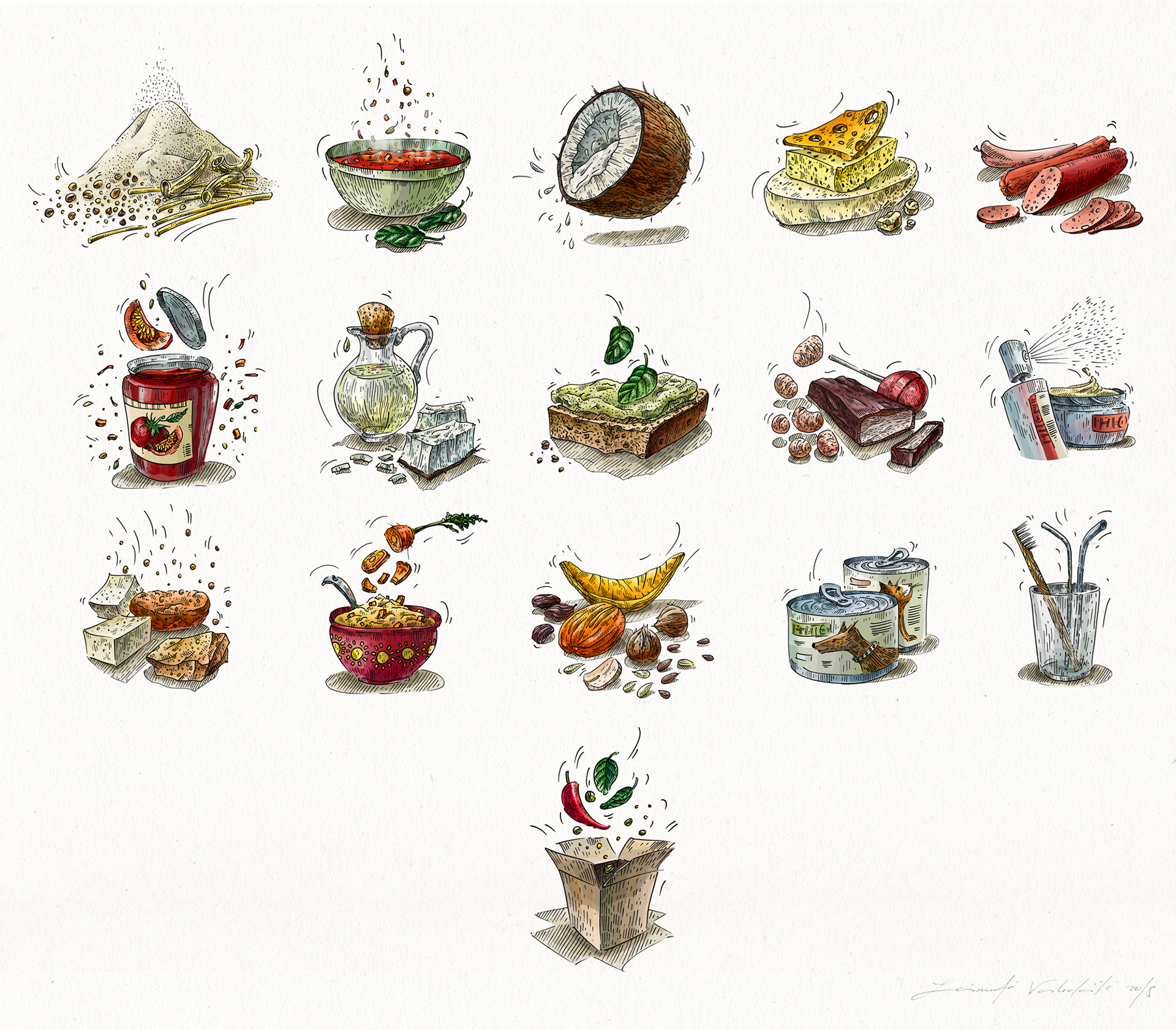
A detail of coloring process, which was one of the biggest challenge this time.
A small size of images really limits a pallete of colors.
But if the aim is to create a realistic illustration, colors are the main aspect which lets do that very well.
Thanks for watching this project! | AČIŪ!